Thursday, December 8, 2011

A weekly update

So after the critique I was thinking some more about what was said about my idea. 
First thing's first, the medium that I am working in.
Originally it was going to be a wire modeling of my body but I was thinking that maybe making a plaster mold might be better. I did run into a few issues with doing it in plaster though. If it was in plaster than it is very much so about me and I don't want it to be too personal. I would rather it be easier to relate to. Yes I want it to be me but a wire modeling is a little more generic than it being exactly me. On the other hand if it was a plaster mold it would show all of the folds and stuff that people may deem as ugly which is what I wanted to address in my project anyway. So right now I'm on the fence choosing the medium. I'm thinking that over the winter break I'm going to experiment with both.
The next issue that I faced was what position would my sculpture/ figurine be in. It was discussed in class that maybe it should be on all fours because that emphasizes one of the facts that I pointed out which is "If Barbie was real she would have to walk on all fours". The issue with having my sculpture be on all fours is that it instantaneously becomes sexual. It becomes about gender and that has nothing to do with my theme so I don't want people to get that idea just by glancing at it. I was thinking about making the pose something like a mannequin or maybe the barbie pose
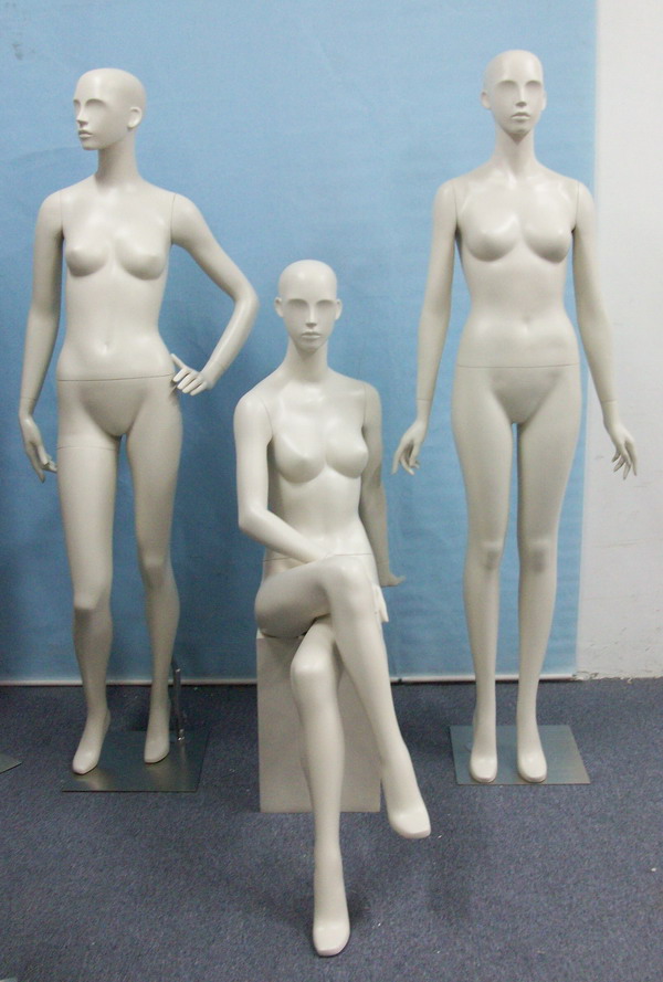
Something That is doll like. The only issue is that if I don't do it in a plaster mold the doll pose may not work as well. If i do the wire modeling I was thinking that the mannequin may look better. But the pose i think would work the best, my favorite pose is something like this. Something That looks insecure.
Either that or something along the lines of having a lot of confidence. Like Maybe holding my stomach while standing in a super confident pose that practically screams 'I am beautiful no matter what my weight is' Like doing something like this but with a smile on the figurine's face. This one would only really look good in plaster because it would be hard to detail in a wire modeling. Either way this is definitely heading in the right direction but i need to get some feedback from some more people and I will make an update blog post soon.

Tuesday, November 1, 2011

Weekly Progress

I have a post that has been sitting in my drafts folder on Blogger that I have been meaning to publish but I'm waiting because I want to add images to it but I can't find my camera wire. But don't worry because I am in the process of looking for it and if I can't find it by the end of the week I will publish the post either way. Sorry about the wait.

Hanging the Chance Show in Mason Gross

I must admit that I was rather hesitant at first to decide where things went and what they would work next to on the wall and whatnot. I imagined I would just sit to the side lines and hang things where people wanted me to hang them. I ended up being dead wrong. Considering I am a rather opinionated person, my more aggressive side came out a little bit when my group's opinion was challenged by the opinion of the artists whose work was in the room. Long story short we all came to a compromise and just ended things but I must admit it was really difficult. It really didn't help that we had the biggest room in the whole gallery and it was the first room that people saw so it just HAD to make a good impression on people. It also didn't help that we misjudged the size of our room so we ended up needing more pieces which did not match our theme at all. In the end it turned out that our room kinda just looked like the room of misfit art projects. I'm definitely not saying that it didn't look good, because I think with our limited restrictions we pulled it together quite nicely, I'm just saying that the theme we started off with completely vanished. I'm still proud of it nonetheless. 

Monday, October 10, 2011

I Don't Want to Fall Behind

Due to me getting sick last week I started to fall behind with my posts, blog submissions and work logs so I wanted to play catch up and let whoever is reading this know that I have NOT forgotten about my blog or my work. I will  soon be posting updates on my work. Most likely tomorrow. But I have been looking at different leaf forms and different colored leaves also leaves that are broken and ripped. I have really been playing with my outlets and I'm excited to see the different in all of them. I'm going to post up the different options so people can decide which one they think works the best. It will also help because I will be able to see which one I like the best as well. Anyway you'll hear from me soon enough.

Sunday, September 25, 2011

My Thoughts on the Exhibition

So when we were asked to look at the work at the Welcome Back show I was excited. I have to admit though that none of the works their popped out more than any others. Like allot of them were cool looking or interesting or funny but none of them were jaw dropping in my opinion. We were asked to find the piece of work which we liked the most and the piece of work that we liked the least. 

The piece of art that I liked the most was Tony Masso's "N-Piece"


When I first saw it I was a little confused. The piece of art is a block "N" which kind of looks like the N found on a wooden block that a child would play with. The wooden N was placed in a frame that looked elegant but it was all cracked and kinda looked destroyed. Also the N was placed to the left opposed to being centered which makes the viewer assume that another letter should be going in the spot that is blank. Like when I saw this the first thing that popped into my head was the word NO. Then I started thinking that if the letter O was next to the N there would have to be another letter next to it unless the kerning of the letters was abnormally large. Then I started playing a word game in my head. What would fit there? Not, Nor, Nah, Nip, Nib, Null. It was fun because in a way it it circled around to being a kids game again. Also, the whole project is painted the same color as the wall which is a juxtaposition for being a kids game/toy because most kids things are vibrantly painted. It raised allot of questions for me and it held my interest for more than a fraction of a second which is more than I can say about most of the other pieces of artwork that were there. Though one of the girls in the class did bring up that this piece would look great alone on a wall and I have to agree with her. Having this piece sit alone in the middle of the wall would look great.

The piece of art that I liked the least was Clifford Owen's remake of "Whipped Cream Piece (Lick Piece),"


I looked at this piece for awhile and I can't get over the fact that this piece just reminds me too much of porn. I understand it's a performance piece and I did my best to try to put some meaning behind it but it's just foreplay to me. Composition wise, I don't understand why the images are laid out the way they are. I don't understand why he is naked as well. It's a very confusing piece that made me reach a point where I didn't want to understand it. It's degrading to the woman who was there and disturbing to anyone who would actually licked this whipped cream off of her. This piece of artwork left me feeling uncomfortable and almost annoyed. I don't mean to sound harsh or rude but it's art like this that makes allot of people scoff at the art community. If there is a deep meaning behind this work then it should have been accented more. I believe this piece should have been left in 1964.

Sunday, September 18, 2011

What I learned in the Critique

Some of the notes that I jotted down were the questions that were being asked while other people were being critiqued. 
The first question that got me thinking was "what is the subject matter?" which brought to my attention that if there is a subject matter (which I assume there should be a subject matter), it should be prominent enough that people should know what it is at least after they've stared at it and thought about it for awhile.
Some of the other things that I was reminded to keep in mind was the composition, color choice, and medium. I'd also like to play with the idea of the work being interactive. If there was some way to make it interactive I know that it would make the piece a little more enjoyable for the audience.
Another question that was asked that I enjoyed was "What is the typical feeling that you want people to have?" And I liked that question because it's really important to think of your audience when placing a piece of work in the gallery.  In class I discussed making a piece of artwork that was overwhelming. I liked that idea because that's the story of my life. I'm constantly doing homework or studying or doing a piece of artwork or working. There's always something that that's why I want my viewer to be overwhelmed as well. I want them to see the amount that I go through every day.
So we discussed the leaves and what I wanted to do as far as cutting them out. I was maybe thinking of putting like my schedule onto a leaf. 
Like one leaf would say:
Monday
9/12/11
10:35-12:35
worked on thesis project for 2 hours

And I would map out every day and every event and in a way it would be so overwhelming and people  would visibly be able to see that.

My reason behind using leaves.... Besides the fact that I like leaves there is a list of other reasons that I would like to use leaves opposed to other paper like objects. 
One reason is the one I pointed out in class. The juxtaposition between the technological aspect of typography and schedules opposed to the natural aspect is really nice. Like it's not too much like an office schedule and it's not too much about nature. I really enjoy that concept.
Another thing I like about leaves is that no two leaves are the same which relates to my schedule thing again. I may officially have the same schedule each week but it's not like I'm doing the exact same thing in the class week after week. In a way leaves are like that where they can look similar but still be different. 
Also, and this reason is purely aesthetic, but since autumn is upon us the leaves are going to be brilliant shades of color which I can use to my advantage. Like if I'm in a bad mood I can use a red leaf and if I'm in a happy mood I can use a yellow leaf but if it's neutral I can use a green leaf. 
So I got allot out of the critique we had and I came up with good ideas. I'm going to work on my ideas and bring in examples for next weeks class. Wish me luck with hoping it comes out okay.

Monday, September 12, 2011

Researching Leaves

I am in group B so I didn't get a chance to have people critique my work yet. 


So I spent the day researching what it is that I eventually want to do for thesis.


The story basically is that I went for a walk one morning during the summer and found this leaf that was bigger than my head. I thought nothing more of it until I started to walk away. I couldn't help but think that I NEEDED to take that leaf and do something with it, anything. While I was walking home with it I came to the conclusion that I wanted to make it into a mask. I cut it up in the sense that I left the veins of the leaf intact and I cut all around them. 


[In case you have no idea what I mean, it was this style of work]


[This is NOT my work, just an example of the style of my work]

I fell in love with this style and made a few more smaller ones (leaves). I want to find some way to incorporate typography onto a leaf and maybe cut it out? I'm still not 100% sure exactly but like I was told by you guys (our teachers), it's good not to have a solid idea because it's probably going to get changed anyway. But this is my main idea and I hope it doesn't change too much.
Here are some more images of my style of work

The main artist who works on this style of work is 
Lorenzo Duran 
and he is definitely gifted